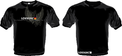
Don't Go Back Sacless

Don't Go Back Sacless
2009's Back To School Poster

Dads and Grads Get Inked

Dads and Grads Get Inked
This poster was designed to promote our tattooed Sac.

Probably my favorite poster we have created to date. This very simple idea really had the response we were looking for during Father's Day. We took this tattoo design and stitched it on a Sac cover. The tattoo was designed by Shawn's cousin, Alex Hinton, a tattoo artist in Salt Lake City, Utah.

Check out Shawn's Blog for comments and feedback.

Moms LoveSac Too

Moms LoveSac Too
The Mother's Day 2009 window poster.

For Mother's Day 2009 we offered the Mom's Blanket, pictured above. This blanket is custom designed for LoveSac by our product developer Spencer Pearson. My objective was to create a stereotypical "mom" environment that showed our product being great for pregnant moms, too. This was a tough campaign to create. I am a fan of tight shots that capture tons of detail. In order to show the mom enjoying the product meant I had to give up my tight shot. After having several ideas shot down by my Creative Director, I finally came up with this one. It's nothing terribly special but it shows the mom enjoying a nap while the entire kitchen is on fire from the dinner she is cooking for the family. 

Shawn started posting the window posters on his blog to get your feedback. He has really established a standard that gives us outstanding feedback from you. According to your opinion, this image is extremely sexist. Our goal was not to be sexist, but to catch your attention. I think we were successful. To read all the opinions of the LoveSacer's check out Shawn's Blog.

LoveSac Shirts Are Here!

The New LoveSac Swag Site
The new site is up and running with 10 new LoveSac shirts to choose from.


My new shirt designs have been printed and we designed a new site just for them. Check out http://www.lovesac.com/tshirt.asp to see all the new designs. Use code LoveShirt to get an additional $2 off for a limited time. Let me know which ones you like the best or if you have ideas for future shirts.

March Madness

March Madness
Click the ad to increase the size. This theme was designed by Mary Doherty.


LoveSac is hosting a March Madness challenge to win one of two Sacs or one of our newly designed t-shirts. The top three scores on LoveSac's Tournament Challenge win prizes. It is free to enter! Check out:
http://www.lovesac.com/march_madness.asp. Invite your friends, it should be a lot of fun! You just need to enter the group LoveSac with the password LOVESAC (case sensitive).

Tropicana Buyers Are Passionate About Packaging

I pulled this article from the New York Times.

Published: February 22, 2009

IT took 24 years, but PepsiCo now has its own version of New Coke.

The PepsiCo Americas Beverages division of PepsiCo is bowing to public demand and scrapping the changes made to a flagship product, Tropicana Pure Premium orange juice. Redesigned packaging that was introduced in early January is being discontinued, executives plan to announce on Monday, and the previous version will be brought back in the next month.

Also returning will be the longtime Tropicana brand symbol, an orange from which a straw protrudes. The symbol, meant to evoke fresh taste, had been supplanted on the new packages by a glass of orange juice.

The about-face comes after consumers complained about the makeover in letters, e-mail messages and telephone calls and clamored for a return of the original look.

Some of those commenting described the new packaging as “ugly” or “stupid,” and resembling “a generic bargain brand” or a “store brand.”

“Do any of these package-design people actually shop for orange juice?” the writer of one e-mail message asked rhetorically. “Because I do, and the new cartons stink.”

Others described the redesign as making it more difficult to distinguish among the varieties of Tropicana or differentiate Tropicana from other orange juices.

Such attention is becoming increasingly common as interactive technologies enable consumers to rapidly convey opinions to marketers.

“You used to wait to go to the water cooler or a cocktail party to talk over something,” said Richard Laermer, chief executive at RLM Public Relations in New York.

“Now, every minute is a cocktail party,” he added. “You write an e-mail and in an hour, you’ve got a fan base agreeing with you.”

That ability to share brickbats or bouquets with other consumers is important because it facilitates the formation of ad hoc groups, more likely to be listened to than individuals.

“There will always be people complaining, and always be people complaining about the complainers,” said Peter Shankman, a public relations executive who specializes in social media. “But this makes it easier to put us together.”

The phenomenon was on display last week when users of Facebook complained about changes to the Web site’s terms of service using methods that included, yes, groups on facebook.com. Facebook yielded to the protests and reverted to its original contract with users.

And in November, many consumers who used Twitter to criticize an ad for Motrin pain reliever received responses within 48 hours from the brand’s maker, a unit of Johnson & Johnson, which apologized for the ad and told them it had been withdrawn.

“Twitter is the ultimate focus group,” Mr. Shankman said. “I can post something and in a minute get feedback from 700 people around the world, giving me their real opinions.”

Neil Campbell, president at Tropicana North America in Chicago, part of PepsiCo Americas Beverages, acknowledged that consumers can communicate with marketers “more readily and more quickly” than ever. “For companies that put consumers at the center of what they do,” he said, “it’s a good thing.”

It was not the volume of the outcries that led to the corporate change of heart, Mr. Campbell said, because “it was a fraction of a percent of the people who buy the product.”

Rather, the criticism is being heeded because it came, Mr. Campbell said in a telephone interview on Friday, from some of “our most loyal consumers.”

“We underestimated the deep emotional bond” they had with the original packaging, he added. “Those consumers are very important to us, so we responded.”

Among those who underestimated that bond was Mr. Campbell himself. In an interview last month to discuss the new packaging, he said, “The straw and orange have been there for a long time, but people have not necessarily had a huge connection to them.”

Reminded of that on Friday, Mr. Campbell said: “What we didn’t get was the passion this very loyal small group of consumers have. That wasn’t something that came out in the research.”

That echoed an explanation offered in 1985 by executives of the Coca-Cola Company in response to the avalanche of complaints when they replaced the original version of Coca-Cola with New Coke: Consumers in focus groups liked the taste of New Coke, but were not told old Coke would disappear. The original version was hastily brought back as Coca-Cola Classic and New Coke eventually fizzed out. (There are, it should be noted, significant differences between the two corporate flip-flops. For instance, the Tropicana changes involved only packaging, not the formula for or taste of the beverage.)

An ad campaign for Tropicana that helped herald the redesigned cartons, also introduced last month, will continue to run, Mr. Campbell said. Print and outdoor ads that have already appeared will not be changed, he added, but future elements of the campaign — like commercials, due in March — would be updated.

Unlike the packaging, the campaign has drawn praise, particularly for including in its family imagery several photographs of fathers and children hugging. Such dad-centric images are rare in food ads.

The campaign, which carries the theme “Squeeze it’s a natural,” was created by Arnell in New York, part of the Omnicom Group. Arnell also created the new version of the Tropicana packaging.

“Tropicana is doing exactly what they should be doing,” Peter Arnell, chairman and chief creative officer at Arnell, said in a separate telephone interview on Friday.

“I’m incredibly surprised by the reaction,” he added, referring to the complaints about his agency’s design work, but “I’m glad Tropicana is getting this kind of attention.”

In fact, Tropicana plans to contact “everyone who called or wrote us” to express opinions, Mr. Campbell said, “and explain to them we’re making the change.”

Tropicana is among several PepsiCo brands whose packaging and logos have been recently redesigned by Arnell. The new logo the agency produced for Pepsi-Cola has been the subject of comments by ad bloggers who perceive a resemblance to the logo for the Barack Obama presidential campaign.

The bloggers have also buzzed about a document outlining the creation of the Pepsi-Cola logo, which appears to have been written by Arnell for PepsiCo executives; Mr. Arnell has declined to comment on the authenticity of the document, which is titled “Breathtaking Design Strategy” and is written in grandiose language.

One aspect of the new Tropicana packaging is being salvaged: plastic caps for the cartons, also designed by Arnell, that are shaped and colored like oranges.

Those caps will be used, Mr. Campbell said, for cartons of Trop 50, a variety of Tropicana with less sugar and calories that is to be introduced soon.

During the interview last month, Mr. Campbell said that Tropicana would spend more than $35 million on the “Squeeze” campaign. Although he declined on Friday to discuss how much it would cost to scrap the new packaging and bring back the previous design, he said the amount “isn’t significant.”

Asked if he was chagrined that consumers rejected the changes he believed they wanted, Mr. Campbell replied: “I feel it’s the right thing to do, to innovate as a company. I wouldn’t want to stop innovating as a result of this. At the same time, if consumers are speaking, you have to listen.”

Easter Promotional, Part III

Made With Real Easter Bunny Phur

Here it is! The Easter promotional poster is finished. This poster will sit in the window of all 25 LoveSac stores located in malls across the United States. Look for it starting February 15th. Thank you to everyone that helped me pull this together. Hopefully this will get people into our stores. The rest is up to our sales team.

Easter Promotional, Part II

The Easter promotional shoot was a great success! The entire cast was an outstanding group. I took a few shots of everyone on my cell phone. Here they are:

No just "the creepy guy"

Kevin Gebhard

The other side of Kevin— a wonderful person to work with. I was able to book Kevin Gebhard, the creepy bunny, and he was an amazing contributor to the shoot. He played his part to perfection. With a cigar in his mouth and his trademark expression, he will absolutely be the focus of all eyes in the malls this Easter.

Phil Swetz

Phil Swetz was the ideal barber. He had the handlebar mustache, the glasses, the part down the middle and the personality to match. He had a ton of energy and, while in character, carried himself like he belonged on Mr. Roger's Neighborhood or maybe even a friend of Floyd's on the Andy Griffith Show.

Roger Hagadone

Roger Hagadone is the best photographer I have ever worked with! He specializes in these types of portraiture and never disappoints. His work is edgy and unique and fits LoveSac's style perfectly. I've used him exclusively for LoveSac photo-shoots and wouldn't want to work with anyone else. His assistant Nick came as well. Nick is a great guy and always keeps the environment light with his clever one-liners. Check out Roger's work by clicking here.

Janet Tallent-Dickson

In addition to the Easter promo-shoot, we photographed our newer t-shirts on two great models: Brian Casey and Amy Meador. In doing so, I decided it may be best to hire hair and make-up. Janet applied for the gig and had a resume that I could not turn down. She recently worked on the set of Prison Break, one of my favorite shows. She was in charge of makeup for Fernando Sucre (Amaury Nolasco) and Theodore "T-Bag" Bagwell (Robert Knepper) in the show. Janet was nothing but professional and very enjoyable to work with. She did an amazing job and I will be sure to book her for future photo shoots.

Michael Warde

Michael Warde is the owner of Montana for Men, the barbershop we used as our studio. Michael was extremely helpful and open to us using anything that we needed. His barbershop offers high-end haircuts with some extras that you don't see in barbershops very often. I was very surprised to see beer on tap in his shop. How relaxing would it be to have a beer while getting a haircut?

Made with Real Bunny Phur

A sneak peek of Monday's photo shoot. Above is a quick snapshot that I took with my phone during the shoot. I can't wait for you to see the final image. You will not be disappointed.

Watch for Part III in a couple of days.

Sac'r Shirts Coming Soon

I am in the process of designing some new t-shirts for LoveSac's website. Below are a few I designed recently. Take a look and let me know which ones you like by voting below. Also, it would be greatly appreciated if you left a comment and let me know why you picked the one you picked. Click on the images to blow them up.


Which shirt do you like the best?


View results


The LoveSac Bus

The LoveSac Bus
The new LoveSac Bus design, just minutes after they completed it.

Check out the design of the new LoveSac Bus. Originally, I had until sometime in January to have it designed, but that all changed on Wednesday, December 24th. Yep, Christmas Eve. Shawn called and asked me if I could finish the bus by 10am Monday morning because he decided he wanted the new design for a series of events- CES Blogger Party, Sundance Film Festival, Winter XGames and the Superbowl. Normally, this would not have been a problem, but I was planning on spending the weekend in New Hampshire visiting family. If I went I would have been locked in a room the entire time working. Plus, my suitcase was still missing from my San Fran/San Diego trip that got me home on Tuesday morning. So, I stayed home to work and wait for my suitcase's arrival. The finished bus wrap is the end result of my Christmas week labor.

Dad's or Grad's Package?

Dad's or Grad's Package
Which would you rather have, the Dad's Package or the Grad's Package?

I just stumbled upon this jpg from last year's 'Dad's or Grad's' promotion. This window poster is also from my very first photo shoot with LoveSac. It was very overwhelming trying to organize the shoot and make sure that I had everything and did everything correctly. They seem so much easier now! Fortunately, it all worked out and ran smoothly. This image was slightly modified to fit on the web. I will post the correct version soon.

Easter Promotional, Part I

I have begun the process of pulling together the Easter promotion. I thought it may be interesting to post the process as it develops.

The process began with a brainstorm session. Our goal is to create an image, for our store windows, that is "remarkable". In the brainstorming session the idea was generated to have an Easter Bunny getting a haircut. That "bunny phur" would then be used as the Easter Sac cover package. The tagline was then coined "Made from real Easter Bunny Phur".


Delux Easter Bunny Costume
This costume seemed to contain the right amount of creepiness.


The first thing I did was order the Easter Bunny costume and some extra phur that I can cut up and use as hair shavings. BuyCostumes.com delivered the costume very quickly.

Love the feel of the decor in this image. Downloadable comp from istockphoto.com.

Cool old retro looking room. Downloadable comp from istockphoto.com.

Love it! Downloadable comp from istockphoto.com.

My research helped further develop the idea. I wanted a 50's feel to the image. I thought a barber with a handlebar mustache would be a cool visual. Our web director remembered a local barber shop that had the look I was thinking of, so we all went to scope it out. They had a 100-year-old barber chair along with several antique barber tools which made this an ideal location for us. I was able to secure the location for a January 26th photo shoot.

Montana for Men 100 year old barber chair.

Montana for Men
The back drop (brick wall) of where I will put the chair to shoot the scene. I will PhotoShop in any retro elements that I feel are needed.

The next step was to book our photographer, Roger Hagadone. Roger is an awesome photographer who specializes in these types of campy shots. He is also a wonderful photographer to work with and always finds ways to improve the overall image and concept. Check out his website: Roger Hagadone.

Phil Swetz
Hired Phil to be our Barber for the shoot.


The next step was to find a barber with a handlebar mustache. I posted an ad on Craig's List and received a response within an hour. Phil Swetz will be perfect! He is booked and ready to shoot.

I then did some research for props. The barber shop that we will be shooting at is willing to let us use anything we would like, but I wanted to make sure we have access to anything that we might think of. I ordered several props from Atlanta Barber and Beauty Supply.


We had another meeting about the promotion and Shawn had the idea to use a creepy man with ears on his head rather than an Easter Bunny outfit. I wasn't 100% on board with this idea but decided we could do both the costume and the man and see which we liked better. The costume came with the ears too so this is at no additional expense.

Kevin Gebhard
Would be perfect for the creepy Easter Bunny.


Now I needed to post an ad for a creepy-looking man with facial hair to use as a model. This didn't come as easily as the barber. After 4 days of submissions I think I have my man. What do you think? I will most likely book him on Tuesday when I get back to the office. The last few things I need to do before the shoot are: make compositional sketches; book hair and makeup; organize the fine details; and make it all happen. I will post a follow-up under Easter Promotional, Part II.

Fiction Family
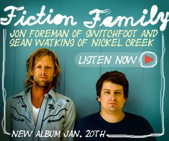

Fiction Family
Jon Foreman of Switchfoot (left) and Sean Watkins of Nickel Creek (right) make up the Fiction Family.

If you're a fan of Switchfoot, Jon Foreman, Nickel Creek or Sean Watkins, you will love this album. The sample album was released on Rhapsody today with the album available on January 20th. Both of these guys are from the same area I am from. I actually had the opportunity to met Sean and his sister through a mutual friend back before they were as big as they are today. Later Sean and his sister played during my friend's wedding. I have been a Switchfoot fan since late 1996 when they released their first album "Legend of Chin" which was in my car's CD player when Kara and I went on our first date in 1997.

Fiction Family
The band's first album artwork.

I posted this not only because I love their music but also because I really like the artwork for the album and campaign, Fiction Family. The colors are great and the look has that retro feel that I really like. Check it out and let me know what you think. "When She's Near" is currently available as a free download on their site.

Sign Designers Need Schooling Too


The Draplin Project

It's hard not to notice poor sign design as a designer. Unfortunately many business owners have no idea what's good or bad design. They are relying on the sign company, expecting them to be professionals in their industry. The sad fact is that small sign companies normally do not have "real" designers creating their signs. Sometimes the owners do it or inexperienced beginning designers create them. Signs are meant to be seen by everyone- they are important advertising tools for your business. It doesn't make sense to go skimpy on them.

Above is a trailer from an upcoming series called The Draplin Project featuring a guy named Aaron Draplin. Aaron’s site is full of interesting stuff and some very nice examples of industrial modernist design.

LoveSac Loves His Mother Earth

The LoveSac Shopping Bag HangTag
Full of LoveSac Humor.

Above is a hangtag that I designed for the LoveSac shopping bag. I actually designed this while I was still working from home in New Hampshire. This was my first glimpse of LoveSac humor. Click on the hangtag to blow up the image.

Branding Barack Obama

Below is a video that explains the process of how they developed the logo for Barack Obama's campaign. It's pretty cool to see the design process.


Part 1
The Obama design process


Part 2
The Obama design process

Pepsi Rebranding

Pepsi
The new Pepsi Branding Effort.


With all of my recent traveling and hard deadlines I didn't even notice that Pepsi released its new branding effort, in the wake if sales slipping 2%, in early November. This logo is said to be smiling or grinning— an updated version of their previous mark that was developed in the early '50s (see below).

The Evolution of Pepsi
A look back of how Pepsi's brand has evolved over the years.


My first impression of the logo was positive. I saw it today in a commercial during a football playoff game. The commercial, celebrating the New Year, was designed in a vector-looking, clean and colorful burst of energy that was centered around typography. As I started to dig for information about it online, I read a lot of negative comments. So, I decided to dig deeper into the creation of it. It took them 5 months and a ton of money to develop the brand.

Things I like about the logo are that it is clean and simple and I like that the graphic seems to really stand alone. In fact, when I saw the commercial I didn't know it was a Pepsi commercial (it doesn't say Pepsi until the end) but thought it was because the mark looked similar to the Pepsi logo. That seems to always be a huge issue when rebranding a company. You need to change the logo enough so that it feels fresh, new and fashion-forward while at the same time holding onto the existing brand identity. With this said, I think the logo is very successful and the campaign works for me. I also appreciate the minimalist intention of this logo. It seems to be going the direction of other popular brands like Apple.


Pepsi Cans
I thought this image was kinda cool looking.


What I don't like are the variations of the logo. I don't like that the mouth changes sizes based on the type of drink. Are they trying to say one drink is better than the other? That doesn't make sense. Why do they get to tell us what they think is the best drink? Shouldn't we get to make that decision? Also, in the midst of a hugely successful "Change" campaign brought to you by Barack Obama [represented by a very cutting edge logo campaign (will post the details soon)], the Pepsi logo almost mimics the strong elements of the Obama design. Maybe this was an oversight, or a coincidence, or done on purpose to play off the ideals of the "Change" theme and its place in America? I honestly don't even feel that the word "Pepsi" is necessary on the can. It seems to throw off the balance of the logo. I think the font is fine. It looks like they kept the wavy line from the old mark in the “e” of the word Pepsi. I like it but feel it is unnecessary since the new mark is so similar to the old one.

The Obama Logo
Flip this upside down and you basically have the the Pepsi logo.