Easter Promotional, Part II

The Easter promotional shoot was a great success! The entire cast was an outstanding group. I took a few shots of everyone on my cell phone. Here they are:

No just "the creepy guy"

Kevin Gebhard

The other side of Kevin— a wonderful person to work with. I was able to book Kevin Gebhard, the creepy bunny, and he was an amazing contributor to the shoot. He played his part to perfection. With a cigar in his mouth and his trademark expression, he will absolutely be the focus of all eyes in the malls this Easter.

Phil Swetz

Phil Swetz was the ideal barber. He had the handlebar mustache, the glasses, the part down the middle and the personality to match. He had a ton of energy and, while in character, carried himself like he belonged on Mr. Roger's Neighborhood or maybe even a friend of Floyd's on the Andy Griffith Show.

Roger Hagadone

Roger Hagadone is the best photographer I have ever worked with! He specializes in these types of portraiture and never disappoints. His work is edgy and unique and fits LoveSac's style perfectly. I've used him exclusively for LoveSac photo-shoots and wouldn't want to work with anyone else. His assistant Nick came as well. Nick is a great guy and always keeps the environment light with his clever one-liners. Check out Roger's work by clicking here.

Janet Tallent-Dickson

In addition to the Easter promo-shoot, we photographed our newer t-shirts on two great models: Brian Casey and Amy Meador. In doing so, I decided it may be best to hire hair and make-up. Janet applied for the gig and had a resume that I could not turn down. She recently worked on the set of Prison Break, one of my favorite shows. She was in charge of makeup for Fernando Sucre (Amaury Nolasco) and Theodore "T-Bag" Bagwell (Robert Knepper) in the show. Janet was nothing but professional and very enjoyable to work with. She did an amazing job and I will be sure to book her for future photo shoots.

Michael Warde

Michael Warde is the owner of Montana for Men, the barbershop we used as our studio. Michael was extremely helpful and open to us using anything that we needed. His barbershop offers high-end haircuts with some extras that you don't see in barbershops very often. I was very surprised to see beer on tap in his shop. How relaxing would it be to have a beer while getting a haircut?

Made with Real Bunny Phur

A sneak peek of Monday's photo shoot. Above is a quick snapshot that I took with my phone during the shoot. I can't wait for you to see the final image. You will not be disappointed.

Watch for Part III in a couple of days.

Sac'r Shirts Coming Soon

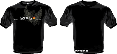
I am in the process of designing some new t-shirts for LoveSac's website. Below are a few I designed recently. Take a look and let me know which ones you like by voting below. Also, it would be greatly appreciated if you left a comment and let me know why you picked the one you picked. Click on the images to blow them up.


Which shirt do you like the best?


View results


The LoveSac Bus

The LoveSac Bus
The new LoveSac Bus design, just minutes after they completed it.

Check out the design of the new LoveSac Bus. Originally, I had until sometime in January to have it designed, but that all changed on Wednesday, December 24th. Yep, Christmas Eve. Shawn called and asked me if I could finish the bus by 10am Monday morning because he decided he wanted the new design for a series of events- CES Blogger Party, Sundance Film Festival, Winter XGames and the Superbowl. Normally, this would not have been a problem, but I was planning on spending the weekend in New Hampshire visiting family. If I went I would have been locked in a room the entire time working. Plus, my suitcase was still missing from my San Fran/San Diego trip that got me home on Tuesday morning. So, I stayed home to work and wait for my suitcase's arrival. The finished bus wrap is the end result of my Christmas week labor.

Dad's or Grad's Package?

Dad's or Grad's Package
Which would you rather have, the Dad's Package or the Grad's Package?

I just stumbled upon this jpg from last year's 'Dad's or Grad's' promotion. This window poster is also from my very first photo shoot with LoveSac. It was very overwhelming trying to organize the shoot and make sure that I had everything and did everything correctly. They seem so much easier now! Fortunately, it all worked out and ran smoothly. This image was slightly modified to fit on the web. I will post the correct version soon.

Easter Promotional, Part I

I have begun the process of pulling together the Easter promotion. I thought it may be interesting to post the process as it develops.

The process began with a brainstorm session. Our goal is to create an image, for our store windows, that is "remarkable". In the brainstorming session the idea was generated to have an Easter Bunny getting a haircut. That "bunny phur" would then be used as the Easter Sac cover package. The tagline was then coined "Made from real Easter Bunny Phur".


Delux Easter Bunny Costume
This costume seemed to contain the right amount of creepiness.


The first thing I did was order the Easter Bunny costume and some extra phur that I can cut up and use as hair shavings. BuyCostumes.com delivered the costume very quickly.

Love the feel of the decor in this image. Downloadable comp from istockphoto.com.

Cool old retro looking room. Downloadable comp from istockphoto.com.

Love it! Downloadable comp from istockphoto.com.

My research helped further develop the idea. I wanted a 50's feel to the image. I thought a barber with a handlebar mustache would be a cool visual. Our web director remembered a local barber shop that had the look I was thinking of, so we all went to scope it out. They had a 100-year-old barber chair along with several antique barber tools which made this an ideal location for us. I was able to secure the location for a January 26th photo shoot.

Montana for Men 100 year old barber chair.

Montana for Men
The back drop (brick wall) of where I will put the chair to shoot the scene. I will PhotoShop in any retro elements that I feel are needed.

The next step was to book our photographer, Roger Hagadone. Roger is an awesome photographer who specializes in these types of campy shots. He is also a wonderful photographer to work with and always finds ways to improve the overall image and concept. Check out his website: Roger Hagadone.

Phil Swetz
Hired Phil to be our Barber for the shoot.


The next step was to find a barber with a handlebar mustache. I posted an ad on Craig's List and received a response within an hour. Phil Swetz will be perfect! He is booked and ready to shoot.

I then did some research for props. The barber shop that we will be shooting at is willing to let us use anything we would like, but I wanted to make sure we have access to anything that we might think of. I ordered several props from Atlanta Barber and Beauty Supply.


We had another meeting about the promotion and Shawn had the idea to use a creepy man with ears on his head rather than an Easter Bunny outfit. I wasn't 100% on board with this idea but decided we could do both the costume and the man and see which we liked better. The costume came with the ears too so this is at no additional expense.

Kevin Gebhard
Would be perfect for the creepy Easter Bunny.


Now I needed to post an ad for a creepy-looking man with facial hair to use as a model. This didn't come as easily as the barber. After 4 days of submissions I think I have my man. What do you think? I will most likely book him on Tuesday when I get back to the office. The last few things I need to do before the shoot are: make compositional sketches; book hair and makeup; organize the fine details; and make it all happen. I will post a follow-up under Easter Promotional, Part II.

Fiction Family


Fiction Family
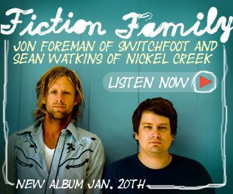
Jon Foreman of Switchfoot (left) and Sean Watkins of Nickel Creek (right) make up the Fiction Family.

If you're a fan of Switchfoot, Jon Foreman, Nickel Creek or Sean Watkins, you will love this album. The sample album was released on Rhapsody today with the album available on January 20th. Both of these guys are from the same area I am from. I actually had the opportunity to met Sean and his sister through a mutual friend back before they were as big as they are today. Later Sean and his sister played during my friend's wedding. I have been a Switchfoot fan since late 1996 when they released their first album "Legend of Chin" which was in my car's CD player when Kara and I went on our first date in 1997.

Fiction Family
The band's first album artwork.

I posted this not only because I love their music but also because I really like the artwork for the album and campaign, Fiction Family. The colors are great and the look has that retro feel that I really like. Check it out and let me know what you think. "When She's Near" is currently available as a free download on their site.

Sign Designers Need Schooling Too


The Draplin Project

It's hard not to notice poor sign design as a designer. Unfortunately many business owners have no idea what's good or bad design. They are relying on the sign company, expecting them to be professionals in their industry. The sad fact is that small sign companies normally do not have "real" designers creating their signs. Sometimes the owners do it or inexperienced beginning designers create them. Signs are meant to be seen by everyone- they are important advertising tools for your business. It doesn't make sense to go skimpy on them.

Above is a trailer from an upcoming series called The Draplin Project featuring a guy named Aaron Draplin. Aaron’s site is full of interesting stuff and some very nice examples of industrial modernist design.

LoveSac Loves His Mother Earth

The LoveSac Shopping Bag HangTag
Full of LoveSac Humor.

Above is a hangtag that I designed for the LoveSac shopping bag. I actually designed this while I was still working from home in New Hampshire. This was my first glimpse of LoveSac humor. Click on the hangtag to blow up the image.

Branding Barack Obama

Below is a video that explains the process of how they developed the logo for Barack Obama's campaign. It's pretty cool to see the design process.


Part 1
The Obama design process


Part 2
The Obama design process

Pepsi Rebranding

Pepsi
The new Pepsi Branding Effort.


With all of my recent traveling and hard deadlines I didn't even notice that Pepsi released its new branding effort, in the wake if sales slipping 2%, in early November. This logo is said to be smiling or grinning— an updated version of their previous mark that was developed in the early '50s (see below).

The Evolution of Pepsi
A look back of how Pepsi's brand has evolved over the years.


My first impression of the logo was positive. I saw it today in a commercial during a football playoff game. The commercial, celebrating the New Year, was designed in a vector-looking, clean and colorful burst of energy that was centered around typography. As I started to dig for information about it online, I read a lot of negative comments. So, I decided to dig deeper into the creation of it. It took them 5 months and a ton of money to develop the brand.

Things I like about the logo are that it is clean and simple and I like that the graphic seems to really stand alone. In fact, when I saw the commercial I didn't know it was a Pepsi commercial (it doesn't say Pepsi until the end) but thought it was because the mark looked similar to the Pepsi logo. That seems to always be a huge issue when rebranding a company. You need to change the logo enough so that it feels fresh, new and fashion-forward while at the same time holding onto the existing brand identity. With this said, I think the logo is very successful and the campaign works for me. I also appreciate the minimalist intention of this logo. It seems to be going the direction of other popular brands like Apple.


Pepsi Cans
I thought this image was kinda cool looking.


What I don't like are the variations of the logo. I don't like that the mouth changes sizes based on the type of drink. Are they trying to say one drink is better than the other? That doesn't make sense. Why do they get to tell us what they think is the best drink? Shouldn't we get to make that decision? Also, in the midst of a hugely successful "Change" campaign brought to you by Barack Obama [represented by a very cutting edge logo campaign (will post the details soon)], the Pepsi logo almost mimics the strong elements of the Obama design. Maybe this was an oversight, or a coincidence, or done on purpose to play off the ideals of the "Change" theme and its place in America? I honestly don't even feel that the word "Pepsi" is necessary on the can. It seems to throw off the balance of the logo. I think the font is fine. It looks like they kept the wavy line from the old mark in the “e” of the word Pepsi. I like it but feel it is unnecessary since the new mark is so similar to the old one.

The Obama Logo
Flip this upside down and you basically have the the Pepsi logo.